This is the final assignment for Digital Art I. The assignment was to draw something in illustrator, import that drawing into Photoshop on top of a photo I took, and then fully integrate the drawing into the photo. Though it was a lot of work I thoroughly enjoyed this assignment. I put many hours into each of my Illustrator drawings... and then spent a good deal more time subverting that work as background or ancillary information when I imported the drawings into my photos. If you have trouble finding the imported images then I've done my job well.
University Work
Tuesday, December 13, 2011
Monday, December 12, 2011
Assignment 6 - Perspective Grid
Below are my finished works for my Perspective Grid assignment. I'm reasonably happy with both, though I have to say that I felt the composition for the exterior scene was more coherent before I added in the logo and text bits that were required. On the other hand, I think the required objects and images added to the interior ended up being very coherent.
For the curious: the upper image (exterior) uses one-point perspective and the lower (interior) uses two-point.
I'm just about finished with the images for the final assignment. It has been a challenge to take the cartoonish Illustrator drawings and bring them into a photo I've taken. I suppose I could have used cartoonish photos (or made mine look that way) but I decided to attempt to make the vector graphics photo-realistic instead. More on those tomorrow.
Sunday, December 4, 2011
Learning the tools: shape builder in Illustrator
I have to say that the Shape Builder is the single coolest thing I've learned about in Illustrator. Drawing curvy lines and making realistic color meshes is neat and all but the Shape Builder makes it quite easy to do exactly what the name says: build shapes. I built the items below in about a half hour or so:
It's true enough that these shapes are basic (well, the Celtic knot isn't, but I was working on that one from an example to be fair). However, these illustrate how easy it is to make any kind of shape quickly with this tool. I have one more object I build with the shape builder during class that is quite a bit more complex. However, I'm planning to integrate it into another image so you'll have to wait to see that one.
It's true enough that these shapes are basic (well, the Celtic knot isn't, but I was working on that one from an example to be fair). However, these illustrate how easy it is to make any kind of shape quickly with this tool. I have one more object I build with the shape builder during class that is quite a bit more complex. However, I'm planning to integrate it into another image so you'll have to wait to see that one.
Arting Out Five and Six of 5
For the most recent--and final--edition of arting out we (my girl Jeilenn and I) decided to support our fellow art students and went to two graduating shows. The first was the MFA show for Memphis College of Art. Four artists had graduating projects on display: one of which being my friend Maggie Russel and another being our own Dwayne Butcher's wife Gatsby. Maggie's work in this show, primarily in charcoal on paper, deals with the concept of identity. The drawings illustrate the concept that we all depend on one another but wall off our sense of self behind cages or nests, sometimes to our detriment. Gatsby's work, in mixed media, was initially a bit of an enigma to me. After thinking on it the impression I was left with is one of playful contempt for backwoods, southern society (ie, rednecks). The repurposed Little Tikes equipment quite literally symbolize that play and her scathing assessment of common vermin, and why it is important that they be eradicated... and possibly eaten (those vicious deer eat our flowers!!), paint the picture of the culture she artfully pokes fun at.
Our second event was the BFA show for University of Memphis at Marshall Arts Studio. There were quite a few exhibitioners here--11 by my recollection with 7 being photographers. The piece that really stuck with me, though, was a found wood and pastel sculpture by Holly Cole. The wood itself almost created an optical illusion of an unending Mobius strip. The real focus, though, was the play of shadows on the wall behind. Holly used multi-colored pastels to highlight existing shadows as well as building new ones creating a dance of color and line to contrast with the stark, unfinished wood.
Our second event was the BFA show for University of Memphis at Marshall Arts Studio. There were quite a few exhibitioners here--11 by my recollection with 7 being photographers. The piece that really stuck with me, though, was a found wood and pastel sculpture by Holly Cole. The wood itself almost created an optical illusion of an unending Mobius strip. The real focus, though, was the play of shadows on the wall behind. Holly used multi-colored pastels to highlight existing shadows as well as building new ones creating a dance of color and line to contrast with the stark, unfinished wood.
Sunday, November 27, 2011
Font Homework
Dwayne tasked us with creating fonts. Thankfully we were allowed to used to tutorials rather than coming up with something on our own. Below are the two I built. We're supposed to have one printed for tomorrow, but I'm not sure which I'll use.
Despite the claim on these tutorials that each should take about an hour I easily tripled that. I didn't make it easy on myself, though, and departed from each tutorial in ways that forced me to learn the ins and outs of the tools. Now I just need to finish up my interior/exterior perspective grid drawings. Too much to do and no time to do it...
Despite the claim on these tutorials that each should take about an hour I easily tripled that. I didn't make it easy on myself, though, and departed from each tutorial in ways that forced me to learn the ins and outs of the tools. Now I just need to finish up my interior/exterior perspective grid drawings. Too much to do and no time to do it...
Monday, November 14, 2011
Assignment 4: Live Trace and Gradient Mesh
Assignment 4 consisted of two separate projects. The first is to use Live Trace on an existing image and then make a logo out of it. The logo can be a re-imagining of an existing logo or something completely made up. The second must be an object made with the Gradient Mesh tool.
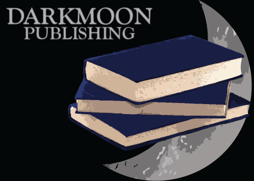
I made up a logo for an imaginary company called Darkmoon Publishing. I used Live Trace on the books and the moon and then further edited each to create my logo. Here are the results:
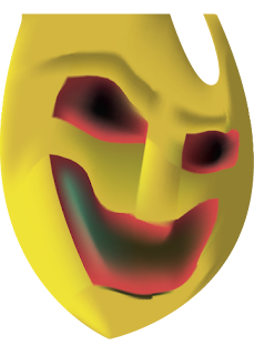
I decided to challenge myself for the Gradient Mesh part of the assignment. I decided to recreate one of the masks in Emil Nolde's Masks using only this tool. I'm not entirely happy with the results but considering the limitations of the tool I think it turned out alright. My rendition is on top and Nolde's original [full] canvas is below.

Sunday, November 13, 2011
Learning the tools: gradient meshes in Illustrator
Last Wednesday we learned to use the gradient mesh tool, which can be used to sculpt and add depth to objects. Here are some examples I created:
In the first of these two objects, the cherries, I did a manual trace of the cherries with the pen tool, then went back and used the gradient mesh to recolor and add depth to the flat "cherries" I drew. In the second I started with a raw, generic rectangle and sculpted a sort of emerald out of it.
In the first of these two objects, the cherries, I did a manual trace of the cherries with the pen tool, then went back and used the gradient mesh to recolor and add depth to the flat "cherries" I drew. In the second I started with a raw, generic rectangle and sculpted a sort of emerald out of it.
Subscribe to:
Comments (Atom)


