This is the final assignment for Digital Art I. The assignment was to draw something in illustrator, import that drawing into Photoshop on top of a photo I took, and then fully integrate the drawing into the photo. Though it was a lot of work I thoroughly enjoyed this assignment. I put many hours into each of my Illustrator drawings... and then spent a good deal more time subverting that work as background or ancillary information when I imported the drawings into my photos. If you have trouble finding the imported images then I've done my job well.
Tuesday, December 13, 2011
Monday, December 12, 2011
Assignment 6 - Perspective Grid
Below are my finished works for my Perspective Grid assignment. I'm reasonably happy with both, though I have to say that I felt the composition for the exterior scene was more coherent before I added in the logo and text bits that were required. On the other hand, I think the required objects and images added to the interior ended up being very coherent.
For the curious: the upper image (exterior) uses one-point perspective and the lower (interior) uses two-point.
I'm just about finished with the images for the final assignment. It has been a challenge to take the cartoonish Illustrator drawings and bring them into a photo I've taken. I suppose I could have used cartoonish photos (or made mine look that way) but I decided to attempt to make the vector graphics photo-realistic instead. More on those tomorrow.
Sunday, December 4, 2011
Learning the tools: shape builder in Illustrator
I have to say that the Shape Builder is the single coolest thing I've learned about in Illustrator. Drawing curvy lines and making realistic color meshes is neat and all but the Shape Builder makes it quite easy to do exactly what the name says: build shapes. I built the items below in about a half hour or so:
It's true enough that these shapes are basic (well, the Celtic knot isn't, but I was working on that one from an example to be fair). However, these illustrate how easy it is to make any kind of shape quickly with this tool. I have one more object I build with the shape builder during class that is quite a bit more complex. However, I'm planning to integrate it into another image so you'll have to wait to see that one.
It's true enough that these shapes are basic (well, the Celtic knot isn't, but I was working on that one from an example to be fair). However, these illustrate how easy it is to make any kind of shape quickly with this tool. I have one more object I build with the shape builder during class that is quite a bit more complex. However, I'm planning to integrate it into another image so you'll have to wait to see that one.
Arting Out Five and Six of 5
For the most recent--and final--edition of arting out we (my girl Jeilenn and I) decided to support our fellow art students and went to two graduating shows. The first was the MFA show for Memphis College of Art. Four artists had graduating projects on display: one of which being my friend Maggie Russel and another being our own Dwayne Butcher's wife Gatsby. Maggie's work in this show, primarily in charcoal on paper, deals with the concept of identity. The drawings illustrate the concept that we all depend on one another but wall off our sense of self behind cages or nests, sometimes to our detriment. Gatsby's work, in mixed media, was initially a bit of an enigma to me. After thinking on it the impression I was left with is one of playful contempt for backwoods, southern society (ie, rednecks). The repurposed Little Tikes equipment quite literally symbolize that play and her scathing assessment of common vermin, and why it is important that they be eradicated... and possibly eaten (those vicious deer eat our flowers!!), paint the picture of the culture she artfully pokes fun at.
Our second event was the BFA show for University of Memphis at Marshall Arts Studio. There were quite a few exhibitioners here--11 by my recollection with 7 being photographers. The piece that really stuck with me, though, was a found wood and pastel sculpture by Holly Cole. The wood itself almost created an optical illusion of an unending Mobius strip. The real focus, though, was the play of shadows on the wall behind. Holly used multi-colored pastels to highlight existing shadows as well as building new ones creating a dance of color and line to contrast with the stark, unfinished wood.
Our second event was the BFA show for University of Memphis at Marshall Arts Studio. There were quite a few exhibitioners here--11 by my recollection with 7 being photographers. The piece that really stuck with me, though, was a found wood and pastel sculpture by Holly Cole. The wood itself almost created an optical illusion of an unending Mobius strip. The real focus, though, was the play of shadows on the wall behind. Holly used multi-colored pastels to highlight existing shadows as well as building new ones creating a dance of color and line to contrast with the stark, unfinished wood.
Sunday, November 27, 2011
Font Homework
Dwayne tasked us with creating fonts. Thankfully we were allowed to used to tutorials rather than coming up with something on our own. Below are the two I built. We're supposed to have one printed for tomorrow, but I'm not sure which I'll use.
Despite the claim on these tutorials that each should take about an hour I easily tripled that. I didn't make it easy on myself, though, and departed from each tutorial in ways that forced me to learn the ins and outs of the tools. Now I just need to finish up my interior/exterior perspective grid drawings. Too much to do and no time to do it...
Despite the claim on these tutorials that each should take about an hour I easily tripled that. I didn't make it easy on myself, though, and departed from each tutorial in ways that forced me to learn the ins and outs of the tools. Now I just need to finish up my interior/exterior perspective grid drawings. Too much to do and no time to do it...
Monday, November 14, 2011
Assignment 4: Live Trace and Gradient Mesh
Assignment 4 consisted of two separate projects. The first is to use Live Trace on an existing image and then make a logo out of it. The logo can be a re-imagining of an existing logo or something completely made up. The second must be an object made with the Gradient Mesh tool.
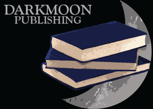
I made up a logo for an imaginary company called Darkmoon Publishing. I used Live Trace on the books and the moon and then further edited each to create my logo. Here are the results:
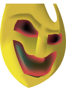
I decided to challenge myself for the Gradient Mesh part of the assignment. I decided to recreate one of the masks in Emil Nolde's Masks using only this tool. I'm not entirely happy with the results but considering the limitations of the tool I think it turned out alright. My rendition is on top and Nolde's original [full] canvas is below.

Sunday, November 13, 2011
Learning the tools: gradient meshes in Illustrator
Last Wednesday we learned to use the gradient mesh tool, which can be used to sculpt and add depth to objects. Here are some examples I created:
In the first of these two objects, the cherries, I did a manual trace of the cherries with the pen tool, then went back and used the gradient mesh to recolor and add depth to the flat "cherries" I drew. In the second I started with a raw, generic rectangle and sculpted a sort of emerald out of it.
In the first of these two objects, the cherries, I did a manual trace of the cherries with the pen tool, then went back and used the gradient mesh to recolor and add depth to the flat "cherries" I drew. In the second I started with a raw, generic rectangle and sculpted a sort of emerald out of it.
Wednesday, November 9, 2011
More Illustrator Learnin'
In addition to the blend tool, we also learned how to combine shapes to create new objects. I think (hope?) this is what Dwayne meant by the "ring tutorial" he said he gave us. We then used the 3D filter to add depth to text (and other objects). Below are my results of these tutorials.
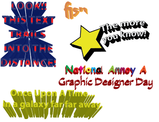
Yes, National Annoy A Graphic Designer Day does use the trifecta of rainbow colors, Comic Sans, and Papyrus. It also has "A" capitalized to annoy grammar teachers. I was going to add a lens flare, too, but that just would have been mean.
We also had to make 5 "3d objects." Yeah... I wasn't able to finish. I got SOMETHING, though!
Monday, November 7, 2011
Learning the Tools: Blending in Illustrator
Today we learned how to use the blending tool. It was not unlike tweening in Photoshop animation. We had to build 5 blended drawings. Here is what I came up with:
Learning the tools: vectors and Illustrator
Last Wednesday dove into Illustrator for the first time... or I did anyway. I had played with it before but mostly felt lost. With the more formal introduction and Illustrator's ability to lay itself out like Photoshop I was able to find myself around a bit better. This first image is what I did doodling around during class as we learned the tools.
Very simplistic, I know. Keep in mind that I'm just learning the tools here. Toward the end of class we were told that our assignment for the weekend was do draw out 5 scenes using the entire artboard in Illustrator. The instructor suggested this would take between 10 and 20 minutes for each. It took a lot longer for me. I probably spent at least 30 minutes on each and still feel like what I made is pretty basic:
For some reason a few of these remind me of video games from the early/mid 90s. The table especially conjures up images of old adventure games like Police Quest. I'm not sure why.
I found the tools in Illustrator cumbersome and somewhat difficult to work with. This was especially so when it came to cropping or deleting portions of an object I had drawn. The process wasn't exactly difficult once I figured it out, but it was still a damn site more complicated than it strictly needed to be. I still haven't figured out how to get the dropper tool working the way I expect it to. I guess I need to keep playing.
Wednesday, November 2, 2011
Vector Art!
So, we're supposed to have some examples (at least 10) of vector art that we find on the web. I know what vector art is (images using shapes based on algorithms instead of a bitmap) and why it is important (much like fractals, vectors can be infinitely resized or shrunk without losing detail or becoming aliased/blocky). However, I had a hard time finding verifiable examples of things I just really liked. So, instead, I simply found examples of vectors I could verify were not just cleverly designed bitmaps. Here goes:
1) This telephone is built using vectors and is in the SVG, or scalable vector graphics, format. If you can't see the image below then it's time to upgrade your browser, kid.

2) This logo for the PostgreSQL project is also an SVG.

3) This logo is for the Linux project.

4) Vector graphics have more of a hand-drawn quality to them. This peacock is rendered as Arabic calligraphy.

5) Most people don't realize this, but animations done in Adobe Flash often use vector graphics.
6) Though this is a JPG export, this portrait was drawn using vectors. The artist is Ghiditya and the piece is called Orange Girl.

7) A character from the very rad graphic novel Scott Pilgrim vs. The World (later a pretty rad movie). The original art is by Bryan Lee O'Malley but this drawing is from mrockz.

8) Another portrait. This one, by SuperPalits, seems to use some pretty advanced techniques.

9) Vectors seem to almost have a cartoonish look to them. Almost as if they are about to start to move.

10) The artist who created this animation took original vector images and animated them with Adobe AfterEffects instead of Flash.
1) This telephone is built using vectors and is in the SVG, or scalable vector graphics, format. If you can't see the image below then it's time to upgrade your browser, kid.
2) This logo for the PostgreSQL project is also an SVG.
3) This logo is for the Linux project.
4) Vector graphics have more of a hand-drawn quality to them. This peacock is rendered as Arabic calligraphy.
5) Most people don't realize this, but animations done in Adobe Flash often use vector graphics.
6) Though this is a JPG export, this portrait was drawn using vectors. The artist is Ghiditya and the piece is called Orange Girl.
7) A character from the very rad graphic novel Scott Pilgrim vs. The World (later a pretty rad movie). The original art is by Bryan Lee O'Malley but this drawing is from mrockz.
8) Another portrait. This one, by SuperPalits, seems to use some pretty advanced techniques.
9) Vectors seem to almost have a cartoonish look to them. Almost as if they are about to start to move.
10) The artist who created this animation took original vector images and animated them with Adobe AfterEffects instead of Flash.
Arting Out - 3 & 4 of 5
(art event 3/5) I failed to write about it previously, but I went to the Cooper Young Festival a month or so ago. Cooper-Young is more of a community awareness event than strictly being about the arts, but many local artists participate by selling their work. While not universal, much of what can be found during the event is somewhat commercial--maybe even pedestrian--and may not be considered "high art" by some. However, there are a few gems for those willing to look. I was especially impressed by some of the found art artists such as the folks operating under the name "Shove It" who recycle old skateboards into jewelry and other works.
(art event 4/5) My family attended the Dia De Lost Muertos event at University of Memphis this past Saturday, October 29th. There were several traditional memorials, ofrendas, setup throughout the main hallway of what is to be the new Fine Art building on campus (previously the law building). The Aztec sand sculpture at the very rear was incredible, too. Unfortunately, I missed the performances due to a misunderstanding of the schedule: they only performed on Sunday.
(art event 4/5) My family attended the Dia De Lost Muertos event at University of Memphis this past Saturday, October 29th. There were several traditional memorials, ofrendas, setup throughout the main hallway of what is to be the new Fine Art building on campus (previously the law building). The Aztec sand sculpture at the very rear was incredible, too. Unfortunately, I missed the performances due to a misunderstanding of the schedule: they only performed on Sunday.
Wednesday, October 26, 2011
Assignment 3 - Stop Motion
This project was... difficult, though not because of technical factors. Time management was the biggest hurdle and I totally underestimated how much time it would take to hand animate something as simple as a stick figure. In any case, I managed to get this done. Below is pictus amicus, my short stop-motion film.
Wednesday, October 12, 2011
Learning the tools for Assignment 3 - swimming duck
Today we're still learning the tools to do our stop-motion. I made this swimming duck in class today. I think MAYBE I'm ready to start stitching my actual movie together... though I have yet to actually take the stills. Soon.
Monday, October 10, 2011
Assignment 3 - Stop-motion video
Our next project is to make a stop-motion video. I'm still struggling for a final idea for this project but to learn the tools I made the video below.
I'm thinking of using Minecraft to build the individual images. I'll have to use screenshots to create the images, which will create a challenge for lining up each image. Maybe I can use crop marks drawn into the landscape to help me with that.
Some examples:
Pac Man in Minecraft
Marcel the Shell (not in Minecraft)
Monday, October 3, 2011
Assignment 2 - Currency - Final Printed Docs
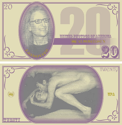
The images here are jpg exports of the final docs I used for printing my currency design assignment. The uniting theme for these bills is famous American photographers. On the face of each bill is a portrait of a famous photog and on the back is one of the more iconic images from that artist. I built the base design/template for the bills from scratch in Photoshop using the previous generation of US currency as inspiration.
Wednesday, September 28, 2011
Assignment 2 - Work In Progress (updated)
My currency creation assignment is moving right along. I'm fairly happy with the concept though I hope I have time to introduce some variation between the bills (other than the portraits/rear images, I mean). Here are samples for both faces of all six:
Because the source images for the portraits and backs varied so much the toning doesn't all match. Ugh. I have two more class sessions to finish these and get them printed. Due Wednesday <bite fingernails />.
Because the source images for the portraits and backs varied so much the toning doesn't all match. Ugh. I have two more class sessions to finish these and get them printed. Due Wednesday <bite fingernails />.
Subscribe to:
Comments (Atom)


