Sunday, September 18, 2011

Assignment 2 - Braintstorming

So, our next assignment is to design a currency.  We'll have to design both sides of 6 bills: 1, 5, 10, 20, 50, and 100.  I've considered everything from Disney characters (Mickey on the $1, of course!) to some variation of Monopoly money.  However, I decided to go with American photographers because money is exactly what every working artist is pretty sure he'll never have.  The photographers I've settled on are:
  • $1, Ansel Adams
  • $5, Edward Weston
  • $10, Sally Mann
  • $20, Annie Leibovitz
  • $50, Diane Arbus
  • $100, Richard Avedon
I feel like I have a good mix of contemporary and pioneering photographers here, and I think I've got each in an appropriate spot.  Now I just need to settle on the images to use on the opposing side of each bill.  I plan to use a well known work from each artist and have a bank of those already.  I just need to solidify and then start mocking up the basics of the bills which I'll save for class tomorrow.

UPDATE: I've included some examples for faces of the 1$ and 5$ bills below.

Original portrait of Ansel Adams
 Bill-ified Ansel Adams with half-toning

Original portrait of Edward Weston
Bill-ified Edward Weston with half-toning

For the reverse of each of these I'll be using a photo taken in Grand Teton National Park from Adams and the famous pepper from Weston.  I haven't started "bill-ifying" these yet, though.


Tuesday, September 13, 2011

Composite Images for Critique

So, for the past few weeks we've been working on our "cutting stuff out" as well as other basic Photoshop skills.  These were to culminate in 5 composite works with specific parameters that would then be critiqued.  Below are those five images.


Of these five I am probably most proud of the last one.  You might need to see the original to notice just what is different.  I had to use all of the skills learned in this class so far (and maybe a few I had picked up through earlier encounters with Photoshop) to update Sam with a more contemporary gesture.

Monday, September 12, 2011

Arting Out (1 & 2/5)

There were several openings on Friday night (September 9th) so I thought I'd step out and see a couple.

(1) The Art Museum at the University of Memphis (AMUM) opened their Nick Cave Memphis Heavyweight exhibit.  The exhibit included video, sculpture, and photos taken from and during the Heavyweight parade in April 2011.  I actually participated in this parade helping to create the Rock'em Sock'em Robot/Anti-Bullying float and was happy to see one of the giant robots in all of its 12' glory on display.  Sadly, the two robots in the float had to be reduced due to heavier-than-expected winds on the day of the parade.  U of M staff were able to secure a lengthy, but very interesting, interview with Cave about the project which was shown in constant loop at the back of the exhibit.  I highly recommend the show to anyone who participated in or saw the parade or just wants to see Memphis art students in action.

(2) Greely Myatt, a working Memphis artist and sculpture professor at the University of Memphis, had an opening at the Lusk Gallery.  The speech bubbles which are so prominent in many of his other works appeared here as well.  Myatt had several pieces on display at Lusk including a giant metal sculpture, painted mostly with primary colors, in the front lobby that could be stepped through.   This and the large, fanned out, wrought-iron screens in the back of the gallery utilized light and shadow as much as they did metal and elbow grease.  The large screens in particular had three different light sources casting a complicate shadow on the wall behind.  Myatt even had some print work on display one of which depicted a conversation bubble storm cloud utilizing what appeared to be a very intricate--and hugely varied--group of screens or wood cuts to create an interesting cacophony of silent sound.  Unfortunately I didn't get a chance to meet Myatt while at the gallery.

Wednesday, September 7, 2011

Image Adjustments

Today we continued to familiarize ourselves with the basic tools of Photoshop.  These after (left) and before (right -- yes I flipped them) images show some of the basic adjustments available as inline layers.  The instructor provided the source images but I just so happen to have a nearly identical version of the Yosemite image I took on vacation several years ago.


In this image we used the clone, patch, and content-aware fill tools to remove boats from the scene.  My removal was a little crude but still fairly believable at first--or maybe even second-glance.  Again I managed to flip these and put the "after" image on the left.


After this we continued working on our composite images.  More of those to come soon!

Wednesday, August 31, 2011

Cut That Out!

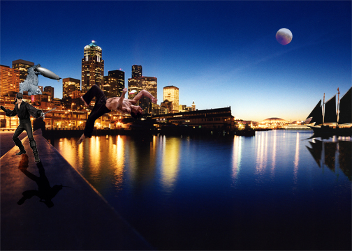
Today we learned to use the lasso tool and its variations to cut up images and paste them into a scene.  We also learned about transformations--scale, rotate, warp, etc--on those objects.  We were tasked with creating several scenes with "10" (the instructor's euphemism for several) new objects integrated into a backdrop.  I finished two which are included below.  Next week we will have to have a total of 10 (a real number this time... I think) of these scenes.  For now, I give you Tsunami Ducks and Pirate vs Ninja On the Bay respectively:


All of the images used to composite these two, with the exception of the duck, were pulled from Google using an image search.


Tuesday, August 30, 2011

ART2301 - Homework - Stuff I Want to Learn Pt.2

More Stuff I Want to Learn:

6) This image by artist Jim Kazanjian [link] is mind-bending.  Like some of the entries in Pt. 1, this is a composite photo but taken in a much more surreal direction.  This image invokes Escher seeming real yet being utterly impossible once it is more closely examined.

7) Tilt-shifting, like toy cameras and toy camera filters, has become somewhat trendy of late.  However, much of the contemporary tilt-shifting is done poorly in Photoshop instead of with a proper tilt-shift lens.  However, being a student who can't always afford a fancy new lens, I'd like to be able to create this effect in a more convincing manner.  This image was borrowed from brainz.org.

8) While I do have some experience with Photoshop and other bitmap editing tools I have almost none with vector graphic tools.  However, being able to create digital, vector-based art can be critical when working in printed media that may need to be re-sized. [link]

9) Halftones are also very handy in print media when gradients are needed but unable to be reproduced reliably (such as in screen printing).  This image, borrowed from Wikipedia, would appear quite smooth when viewed from a distance.

10) I already use Photoshop and other tools to retouch photos.  But, when it comes to color correction, it would be more accurate to say that I play around with settings until I find something that looks close to correct.  However, it is important that I learn to be able to perform proper color correction if I am to be successful as digital photographer.

11) Finally, I would also like to learn some basic video editing.  The video below, a fan film based on the popular video game Half-Life, is a mixture of in-game and live footage used to tell a new and compelling story.


Monday, August 29, 2011

ART2301 - Homework - Stuff I Want to Learn Pt.1

I think it's traditional, as a christening no doubt, to welcome the world to a new blog when it is birthed.  So... welcome!  This blog is being setup as a part of the ART2301 (Digital Art I) class I'm taking this semester.  The instructor has asked us to set this up to track our research, progress, and work throughout the course so that he may keep an eye one us and that we may more easily communicate with our classmates.  However, if I can muster the will, I may keep this going for the rest of my time at university.  We'll see.

For now he has given us an assignment to find 10 examples of digital art that we want to learn to make.  Here are my first five:

1) A composite photograph by Homato [link].  This image layers several photos of the same scene to create a crowd (cloud?!) of airplanes.  This many airplanes would have required several hours or even days to take all of the shots yet the exposure on each seems to be basically the same.  Learning to match exposure between images that were taken with slightly, or even drastically, different lighting conditions is important to my work as a photographer.

2) This next image, titled Snaippo, is also a composite though it is taken in a different direction.  It is by an artist going by the name of "humandescent" on Deviantart [link]. What I appreciate most with this type of composite is the artist's ability to combine two extremely different creatures into something new and even believable.

3) Next is a type of moving image called a cinemagraph.  This one, originally a series of stills of model Coco Rocha, was found on Cinemagraphs.com and is by the artists Jamie Beck and Kevin Burg.  These images use skillfully crafted animated GIFs that bring a single moment to life not unlike the moving photos of the Harry Potter films.

4) This image is a shameless plug as it is my own.  It was taken in Dublin in 2009 shooting across the River Liffey.  However, this image is not the original.  A pre-fab filter was used to make it look like it was taken on a toy camera when, in reality, an iPhone 3G was used.  This style is exceptionally trendy today but I want to be able to create custom effects for my images that set the mood of the story I'm trying to tell--and not necessarily just those of the hipster variety.

5) This last image in Pt.1 of Stuff I Want to Learn is by the artist Zippo12, also on DeviantArt [link].  The image itself is just okay but it does illustrate a technical ability I wish to attain.  The shapes and pseudo-text (runes?) are created, placed, and grouped very precisely.

Tomorrow, Pt. 2!