Wednesday, October 26, 2011
Assignment 3 - Stop Motion
This project was... difficult, though not because of technical factors. Time management was the biggest hurdle and I totally underestimated how much time it would take to hand animate something as simple as a stick figure. In any case, I managed to get this done. Below is pictus amicus, my short stop-motion film.

Wednesday, October 12, 2011
Learning the tools for Assignment 3 - swimming duck
Today we're still learning the tools to do our stop-motion. I made this swimming duck in class today. I think MAYBE I'm ready to start stitching my actual movie together... though I have yet to actually take the stills. Soon.
Monday, October 10, 2011
Assignment 3 - Stop-motion video
Our next project is to make a stop-motion video. I'm still struggling for a final idea for this project but to learn the tools I made the video below.
I'm thinking of using Minecraft to build the individual images. I'll have to use screenshots to create the images, which will create a challenge for lining up each image. Maybe I can use crop marks drawn into the landscape to help me with that.
Some examples:
Pac Man in Minecraft
Marcel the Shell (not in Minecraft)
I'm thinking of using Minecraft to build the individual images. I'll have to use screenshots to create the images, which will create a challenge for lining up each image. Maybe I can use crop marks drawn into the landscape to help me with that.
Some examples:
Pac Man in Minecraft
Marcel the Shell (not in Minecraft)
Monday, October 3, 2011
Assignment 2 - Currency - Final Printed Docs
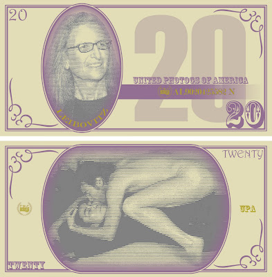
The images here are jpg exports of the final docs I used for printing my currency design assignment. The uniting theme for these bills is famous American photographers. On the face of each bill is a portrait of a famous photog and on the back is one of the more iconic images from that artist. I built the base design/template for the bills from scratch in Photoshop using the previous generation of US currency as inspiration.




Wednesday, September 28, 2011
Assignment 2 - Work In Progress (updated)
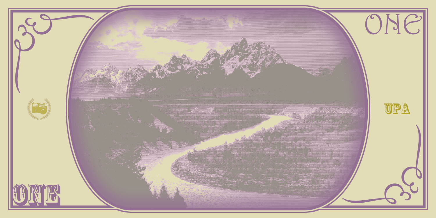
My currency creation assignment is moving right along. I'm fairly happy with the concept though I hope I have time to introduce some variation between the bills (other than the portraits/rear images, I mean). Here are samples for both faces of all six:


Because the source images for the portraits and backs varied so much the toning doesn't all match. Ugh. I have two more class sessions to finish these and get them printed. Due Wednesday <bite fingernails />.



Because the source images for the portraits and backs varied so much the toning doesn't all match. Ugh. I have two more class sessions to finish these and get them printed. Due Wednesday <bite fingernails />.
Sunday, September 18, 2011
Assignment 2 - Braintstorming
So, our next assignment is to design a currency. We'll have to design both sides of 6 bills: 1, 5, 10, 20, 50, and 100. I've considered everything from Disney characters (Mickey on the $1, of course!) to some variation of Monopoly money. However, I decided to go with American photographers because money is exactly what every working artist is pretty sure he'll never have. The photographers I've settled on are:
UPDATE: I've included some examples for faces of the 1$ and 5$ bills below.
Original portrait of Ansel Adams
 Bill-ified Ansel Adams with half-toning

Original portrait of Edward Weston
 Bill-ified Edward Weston with half-toning

For the reverse of each of these I'll be using a photo taken in Grand Teton National Park from Adams and the famous pepper from Weston. I haven't started "bill-ifying" these yet, though.


- $1, Ansel Adams
- $5, Edward Weston
- $10, Sally Mann
- $20, Annie Leibovitz
- $50, Diane Arbus
- $100, Richard Avedon
UPDATE: I've included some examples for faces of the 1$ and 5$ bills below.
Original portrait of Ansel Adams


Original portrait of Edward Weston


For the reverse of each of these I'll be using a photo taken in Grand Teton National Park from Adams and the famous pepper from Weston. I haven't started "bill-ifying" these yet, though.


Tuesday, September 13, 2011
Composite Images for Critique
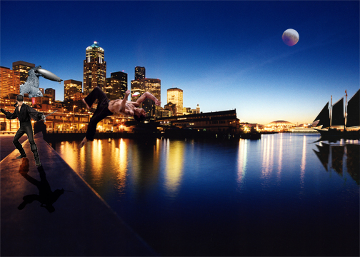
So, for the past few weeks we've been working on our "cutting stuff out" as well as other basic Photoshop skills. These were to culminate in 5 composite works with specific parameters that would then be critiqued. Below are those five images.


Of these five I am probably most proud of the last one. You might need to see the original to notice just what is different. I had to use all of the skills learned in this class so far (and maybe a few I had picked up through earlier encounters with Photoshop) to update Sam with a more contemporary gesture.


Of these five I am probably most proud of the last one. You might need to see the original to notice just what is different. I had to use all of the skills learned in this class so far (and maybe a few I had picked up through earlier encounters with Photoshop) to update Sam with a more contemporary gesture.
Subscribe to:
Posts (Atom)